New Zealand Trustee Services

JFM Marketing and Design worked with New Zealand Trustee Services Ltd to create a new brand identity and website last year.  

 The overall feel for the new brand was one of clarity, energy, trustworthiness, professional integrity, and structural accuracy.  Their approachable “New Zealand” character was also represented in the brand work.

The use of blue in depicting an iconic silver fern is a reflection of New Zealand sky and water, and the bright energy going into a new phase of a brand.  

A suit of collateral was created for use across the business; imagery was carefully selected to reinforce the importance of relationships. 

The new website design is clean, minimal but not sterile. Utilising the bright blue as a pop colour through the website allowed the vibrancy to be balanced off with a grey.

The website was created using a sectional scroll with responsive functionality, which allows large amounts of content to be accessed seamlessly and intuitively, on any device.

Want to find out more about how the team at JFM Marketing + Design can refresh your brand or build your new website? Give us a call today on 03 308 6272.


Scott Simpson

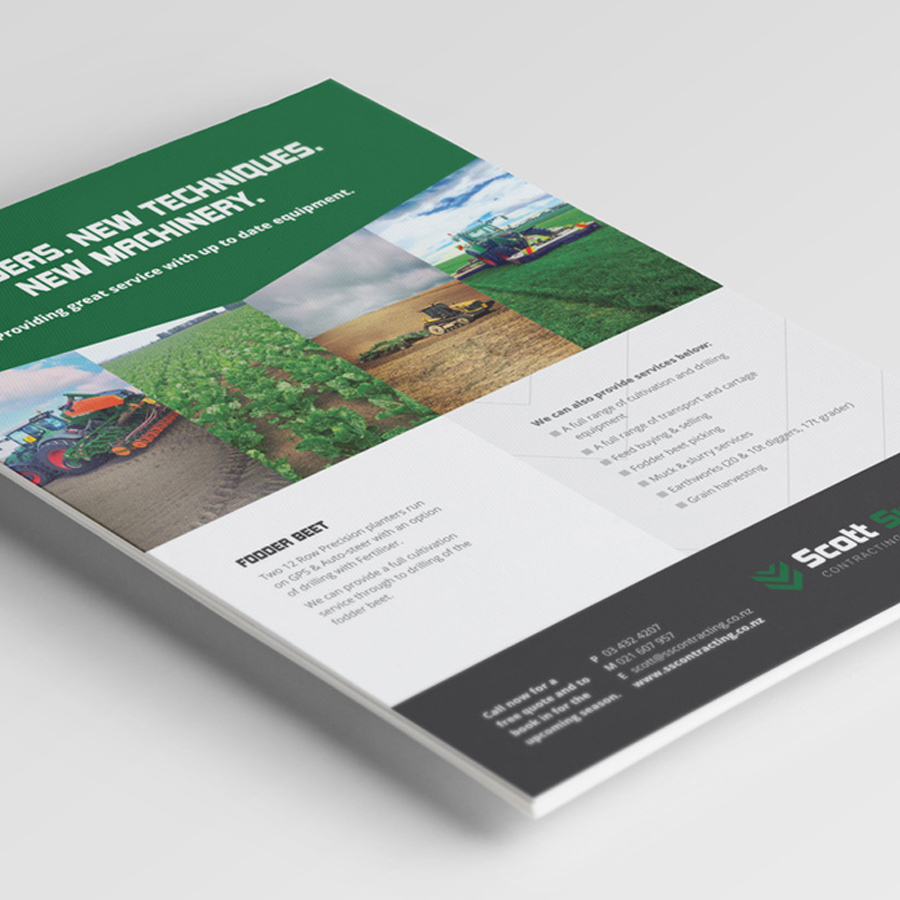
Scott Simpson Contracting owned by Scott and Lisa Simpson provides high quality agricultural services to the North Otago area.  We were contacted to design a fresh brand identity (logo) and create an effective website to promote the company’s contracting and straw trading services online.  As it was peak season and there was a need to quickly advertise the feed for sale, we were tasked to provide these assets within a short time frame.

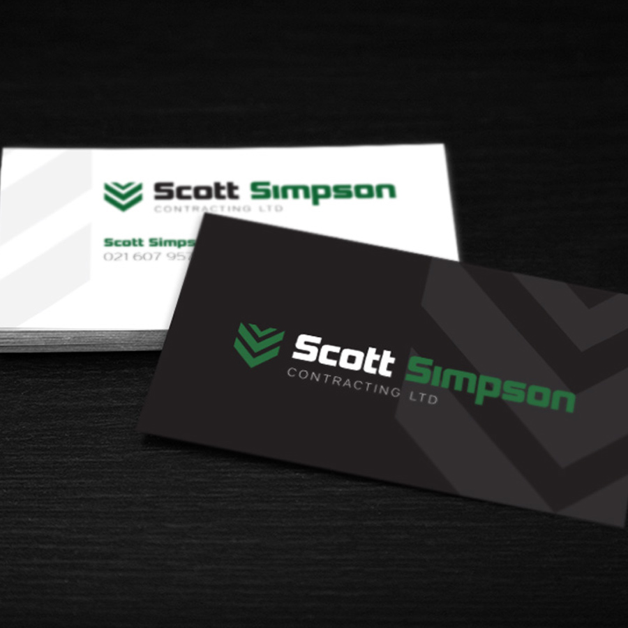
Our brief was to creatively design a logo and supporting icon element which would be clear and easy to read on machinery and edgy.  To achieve this, font selection was critical, along with branding colours that complimented the agricultural industry and resonated with their loyal client base.

Like many contractors, their modern fleet of machinery travelling around the local district is one of their most effective forms of marketing to prospective clients.  So for Scott Simpson Contracting, the application of their brand livery on vehicle and signage was of most importance.  Our creative designer Justine Tull kept this core requirement in mind to develop a clear and solid icon, to suit the hard working equipment and quality services provided. We designed an icon that represents a stylised wheat head and also represents tractor tyre marks.

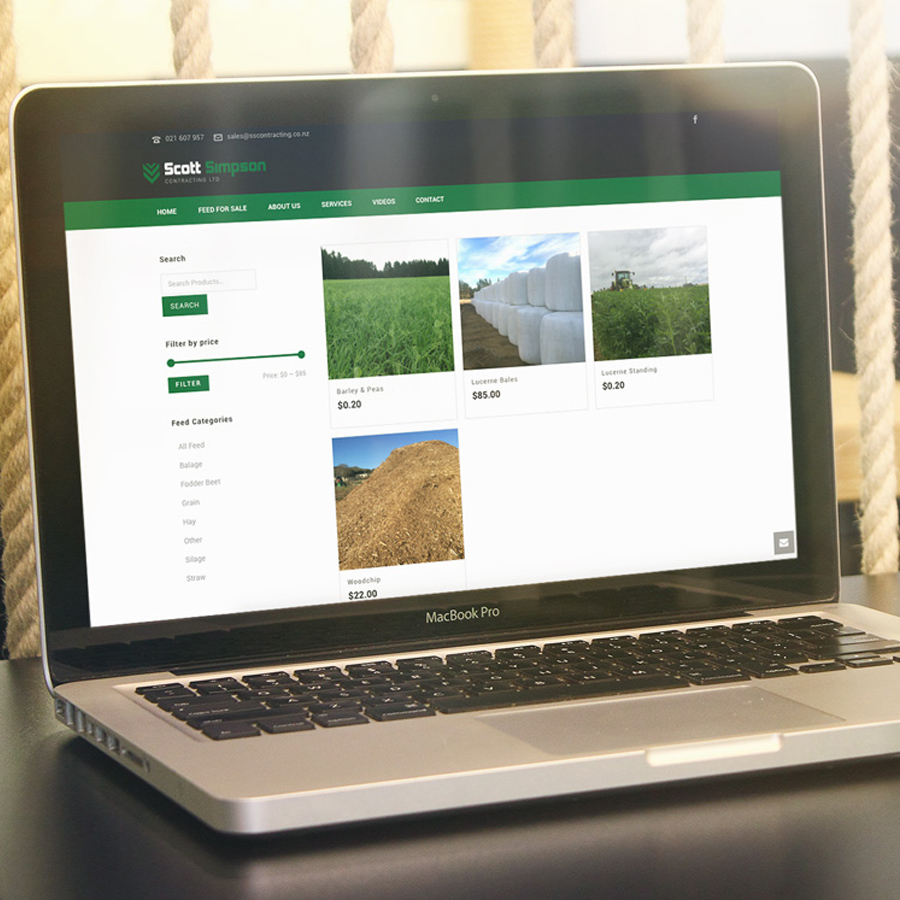
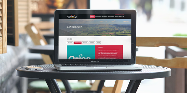
The Scott Simpson Contracting website needed to showcase the extensive range of contracting services they provide and showcase “feed for sale” including quantities and specific product details.  This functionality allows a customer to search of the type of feed they are looking for from anywhere in New Zealand and for an enquiry to be sent through to their Operations Manager, who will discuss their order along with freight options.  With the rural audience varying in age demographic, a sleek, clean and easy to navigate website was designed using the bold colours from the logo, along with the angles of the icon.

Large hero images and a gallery showcasing the up to date equipment used are featured on the website.  As with all our websites, this one has a “responsive design” which ensures the website looks great on a PC, tablet and phone.

At JFM Marketing and Design, we can help businesses of all sizes with their marketing requirements throughout New Zealand.  If you need a logo, website or any marketing collateral to promote your business, give us a call!

Crafts inspired trends…

A Tale of Two Design Trends…Will You Choose Pattern?

2017 is going to be a year of individualism in graphic design. Flat design was a very welcome addition to graphics last year, helping to simplify layouts and improve user experience, but it became so popular that it now feels saturated. This year we’ll see more arts and crafts inspired trends, and pattern and print will return in a big way.

For packaging and brand design, bringing together the best qualities of flat design and pattern will create vibrant, colourful products which feel at once both ultra-contemporary and artistic.

Greenery is nature’s neutral…

Greenery – Pantone Colour of the year (15-0343).

What is the PANTONE Colour of the Year?
A symbolic colour selection; a colour snapshot of what we see taking place in our global culture that serves as an expression of a mood and an attitude.

A refreshing and revitalising shade, Greenery is symbolic of new beginnings.
Greenery is a fresh and zesty yellow-green shade that evokes the first days of spring when nature’s greens revive, restore and renew. Illustrative of flourishing foliage and the lushness of the great outdoors, the fortifying attributes of Greenery signals consumers to take a deep breath, oxygenate and reinvigorate.

Greenery is nature’s neutral. The more submerged people are in modern life, the greater their innate craving to immerse themselves in the physical beauty and inherent unity of the natural world. This shift is reflected by the proliferation of all things expressive of Greenery in daily lives through urban planning, architecture, lifestyle and design choices globally. A constant on the periphery, Greenery is now being pulled to the forefront – it is an omnipresent hue around the world.

Click here to find out more.

The perfect font for editorial with a difference…

Font of the month – Yuzu

Yuzu is a soft sans for branding and editorial. It features rounded stroke-endings, slightly narrow caps and smooth terminals. Yuzu is the perfect font for editorial with a difference with light to extra bold options( 5 different weights).

Click here to find out more or purchase…

This trend aims to break the rules…

Trend of the month – Abstract Chaos

This trend aims to break the rules. Deconstruct and distorting layouts in a seemingly random way.

This year is all about chaos in design. In contrast to the more excessive, 80’s inspired styles, a rebellious, minimalist trend is evolving. Unlike the popular card layout trend, this trend aims to break the rules. Deconstruct and distorting layouts in a seemingly random way.

Sample image created by Nose Press by Ben Johnson for Elegant Seagulls.

Welcome to our new look e-news

Welcome to our new look e-news

Welcome to our new look JFM E-news.  We decided we would take some of our own advice about keeping your brand and communication refreshed, up to date and relevant. So here it is… I hope you will enjoy it and would love to hear what you think, or what you might like to see included in the next edition.I have managed to chat to a few clients about James and my exciting news, but for anyone who I have not been able to catch up with just yet, we are expecting a new addition to our family, a baby boy who is due in August. Please let me reassure you that you will see no change in the service offered by JFM. JFM will continue to operate as normal assisting our clients with their marketing requirements while I am away from the office. I am planning on finishing in late July and returning in November.

One of the conversations I am having increasingly with clients is about their customer segmentation and how they gain a better understanding the different segments and in turn, manage their customer data. In todays marketing world it is important to have brand presence, however the business needs to be able to address the ‘customer of one’ or in other words make it personal to each customer. Knowing and understanding each customer will enable a business to be competitive and acquire and retain business.

Looking forward to the future of marketing and being able to take ‘knowing your customer’ to the next step is being able to predict your customer requirements or next purchase. As an example I have just purchased a cot and nursery furniture, so if the business that I purchased these from know that, they could then also market baby clothing and toys to me – it is not just about knowing your customer today but predicting what they want next from your business and into the future.

It is also important for any business to understand the fundamentals of their marketing and why they should continue with their marketing activity regardless of the economy. Remembering that customers come in and out of the buying cycle as their life changes and develops. Price is not the number one motivator for most purchases, its more about a need and want.

Kind regards,
Jo Foster
Founder + Marketing Consultant

What makes a great brand?

What makes a great brand?

We can all think of brands that we like in the market and when thinking of these it maybe the shape or color of the logo or the service or product that you get from the business. Our thoughts and feelings on a brand can make it complex for any business to understand.

One of the things when developing or refreshing a brand is understanding who buys your products or services and how, what, when and why they purchase is critical because it provides direction for the tone and reach, along with the overall identity of a brand. Great brands go beyond the brand to understand its real value to existing customers but also to tomorrow’s customers.

Clear Brand Strategy

For a brand to succeed, a strong undiluted brand message must exist internally but must also consistently connect with customers through various touch points. They also demonstrate a clear story delivered with passion about who they are what they do and why they matter. This focused and consistent message is not just a marketing message but an ingrained set of values which consumers buy into with passion.
Everyone Must Live the Brand
In line with the brand strategy, a vital aspect of any brand success is that the people within that brand actually demonstrate what they preach; in essence they live that lifestyle, support that brand and contribute to its success.
Uniqueness
Great brands also develop their own uniqueness, not just the product or service but the whole package.
Unfortunately, too many business’s fall in love with their brands and believe the brands speak for themselves. Having a strong point of difference in your brand is a major advantage, and developing a great messaging platform will keep your brand unique. The more distance you have from your competition, the tighter your connection will be to your customers. Do you know what your unique product, service, or selling point is? If you think you would like to know more talk to us today.

Thinking about writing a marketing plan?

Thinking about writing a marketing plan?

Without a solid marketing plan, too much is left to chance. When you rely on “hope based marketing” you’re at very high risk of losing money, time, and traction, because nothing is strategic and everything is reactive. As the old adage states, “A failure to plan is a plan to fail”

Developing a marketing plan will allow a business to plan the majority of its marketing and communication activity for the year. However it does need to be flexible enough to be able to make the most of market opportunities that may arise after the plan is developed.

A marketing plan is a detailed roadmap that outlines your marketing strategies, tactics, costs and projected results over a period of time. Your marketing plan and budget keeps your entire team focused on specific goals – it’s a critical resource for your entire business.

Some statistics have shown that up to 85% of small- to mid-size companies operate from a budget only — without a written plan to accompany it. This explains why so many marketers are tactically focused – they’re figuring out how to spend a defined budget, instead of thinking about goals and strategies.
Writing a marketing plan is a time-consuming exercise, but it forces you to think through your strategies and relevant tactics.
It takes time to develop a good marketing plan and budget, but it’s important because it ties all of your activities to tangible goals.
It’s also a great opportunity to focus on the future, generate new ideas, and inspire your team. Even a simple plan is better than none, but when you invest more effort upfront, you’ll have a better roadmap toward your goals.

Our Recent Client Work

Our Recent Client Work

Check out what some of our clients have done recently;
jfm-advertising-and-design-news-2016-may-b-2
Brand – Sebco brand refresh Requirement:
As the business has grown and evolved the brand needed to reflect this and todays market.
jfm-advertising-and-design-news-2016-may-b-
Promotional items – Vision Insurance Requirement:
Needed promotional items giveaways for clients and tradeshow. The wine knives and golf balls were specifically for the members of the Bed and Breakfast Assn conference.

jfm-advertising-and-design-news-2016-may-b-3

Website – Lemacon Requirement:
To create a story about how they do business within different regions, matching the regional requirements.
jfm-advertising-and-design-news-2016-may-b-4
Website – YOA Requirement:
Presenting a profile of the services and online products utlised by YOA and their clients.
jfm-advertising-and-design-news-2016-may-b-6
Advertising – Veehof Requirements:
 jfm-advertising-and-design-news-2016-may-b-5
Advertising – Laing Properties Requirements:
To build a brand presence in the Canterbury media.
I would love to know what you think of our new look E-News or what you would like to see in here so drop me a line or give me a call.