A brand for a company is like…
“A brand for a company is like reputation for a person. You earn reputation by trying to do hard things well.”
– Jeff Bezos (CEO Amazon)


“A brand for a company is like reputation for a person. You earn reputation by trying to do hard things well.”
– Jeff Bezos (CEO Amazon)

Growing pains are a big challenge for many businesses and this was the case for Ellesmere Agriculture Ltd.
With an established market reputation and a well recognised brand identity, one of the concerns for Ellesmere Agriculture Ltd was updating their brand communications to reflect an evolved business offering whilst ensuring they did not lose the loyalty of existing customers and team members. We worked closely with the leadership of Ellesmere Agricultural Ltd to explore the possible directions for developing their brand, and ultimately established that the most effective strategy was to stay true to the heritage of the business by simplifying the brand name and evolving the logo – rather than introducing a completely new look to the market. By shortening the brand name to “EA”, a description already commonly used by the market, and adding the letter L for limited, we ensured the business did not suddenly become an unknown entity to the market. We widened the suggestion of EAL’s business offering by adding the description “AgriServices Group”, which allows the market to understand that EAL offers more than one service. The word “Group” was included to describe that the business extends well beyond it’s original Ellesmere location to include team members based in another service hub. In essence, we’ve simplified the name down to a summary of the complicated evolution of this hard-working and successful business.
To ensure staff, loyal customers and the wider market instantly recognised the new brand name and continued to apply those positive associations previously attached to the Ellesmere Agriculture Ltd name, we felt the look and feel of this simplified brand name had to retain a recognisable link to the established logo. The new logo needed to be seen as an evolution rather than a revolution. By retaining the “feel” of the old logo, but redesigning the line widths and structure of the three letters in the new main icon, we suggest a more balanced and solid brand. Viewers feel comfortable seeing very familiar shapes and colours within the logo, yet will also feel that the brand has “more to it” now.

It has been with great pleasure to work along side Sandy & Fred Hoekstra to launch their fresh new website last week. When Veehof asked JFM to design and build a new website for their business, the brief was to create a website that was fresh and aligned with their professional customer service and product offering, which they’ve come to be known for.
One of the first steps of a website build is the wire framing of the site (how will each page look and feel, what information will we put in front of a customer at any point in time, how can we engage them further with a product, service or our brand promise) this ultimately creates the conversion path to sale or contact.
For Veehof, this meant three key areas of focus; ease of navigation, a platform for education and information sharing along with a product showcase. Providing farmers and Veterinarians a website experience which makes building their own Wopa Cattle Crush (Standard, Mobile, Pro and Pro+) with all the bells and whistles (20 plus add-on’s) was a challenge our creative team were up for. Our approach to communicating all the important points like always, centred on the end goal goal in mind; building brand awareness and contributing towards business performance without forgetting the addage features tell, benefits sell.
The website forms one cog of a much larger wheel for Veehof. Their website is also used as an information and application portal for their ever popular one-day workshops and advanced courses. With website data connected to a series of cloud based software integrations, this enables streamlined communication, registration and administration processes with course participants from throughout New Zealand; a key ingredient in striving to gain operational efficiencies and enhancing the customer experience.
Consumers are becoming more educated about a product or service before purchasing decisions are made; all the information in the world, is at their finger tips. What does it take to make B2C or B2B interactions more timely and more relevant than the competition? It can often mean changing the perspective at which we look at our businesses; it takes courage to innovate. Price will always be a consideration, but by demonstrating a business understands what’s important in the lives of their consumer it shows they’re more relevant, responsive, and connected.
If you have a moment, feel free to connect with Veehof and browse around their webiste – www.veehof.co.nz

It’s an awesome feeling when you make someone’s day. It’s even better when you bring a smile to a complete stranger’s face, and encourage them to do the same for someone else.
That’s the genesis of the Pay It Forward movement: doing a random act of kindness that inspires another and multiples into many more. So when our marketing team came up with the idea of Xero paying it forward for small business owners (#xeropaysitforward), I thought it was an awesome way to get behind this social movement. We get to give something back to small businesses and their customers (and get them to pay it forward too, of course).
Here’s how #xeropaysitforward played out:
▪ We asked Xero staff in every Australian office to nominate a business (and amount) they wanted to pay it forward to.
▪ We visited these businesses – ranging from cafes and eateries to barbers, gyms and even Bondi Icebergs Club – and paid it forward to them.
▪ When customers went to pay, they were handed a card and told that “this one’s been paid for by Xero”.
▪ We filmed/photographed peoples’ reactions, and encouraged them to pay it forward.

We have recently just finished an exciting brand building project with Argyle Welsh Finnigan.
AWF wanted a creative way to keep their team engaged with the transition period involved in moving premises. We suggested a visually striking timeline with unique “repositionable” sticker elements which allowed for information to be adjusted across the timeline. For a staff only message, the information on some of the stickers included key milestones in the building project while other stickers carried specific meaning for team members. By using the milestone stickers only, the timeline graphic also became a fantastic way to keep AWF clients informed of progress on the move.
The flexible messaging and visual potential of this signage method can be used in many different ways. Directional instructions, engaging and ever-evolving communications with the team or just a fun visual you can play with. In working with AWF on this project, we found this re-positional signage to be a highly interactive way to show your team where you are and where you need to be.
When values align between two businesses, the results can be spectacular.
JFM was honoured to be invited to work with Georgina Torrington on a new brand identity project with Continental in Rangiora, Canterbury.
As soon as we met the Continental team, we realised their passion for excellence and drive to create a unique, positive experience for the people they deal with was going to line up perfectly with the way JFM likes to work. In constructing a new facility, Continental envisaged a unique café that would attract visitors from far and wide. Knowing the Continental team has been held in high esteem for the past 50 years, we absolutely believed in their vision. So we set about creating an identity and communication which matched the promised delights for café visitors.
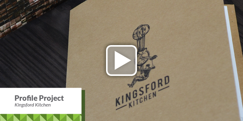
The Kingsford Kitchen brand identity is a delightful creative brain implosion. One minute the creative concept was dwelling on kitchen utensils which suggested hand-crafted quality, the next minute somebody noticed how much a sketch of an upturned egg beater looks like a Da Vinci flying machine… which segued perfectly into the cafe’s name. Kingsford Kitchen is located on Kingsford Smith Drive, named after legendary Australian aviator Charles Kingsford Smith who landed near the location in 1928 on the return leg of the first ever Trans Tasman flight. With those realisations cleared for take off, there was nothing else to do but illustrate a pioneering pilot flying an egg beater.
Click here to see the video clip to find out how JFM developed the corporate logo and brand identity for Kingsford Kitchen – Rangioria’s latest start-up cafe.

Use ‘attraction marketing’ and not pursuit marketing
I am sure you will have noticed what happens whenever a beautiful woman or a handsome man walks into a crowded room or a bar? People look at them. In fact, some people will actually walk over to them and offer them a drink or strike up a conversation with them. The reason we call these kind of physically striking people ‘attractive’ is that they literally attract the attention and also the interest of other people.
So, you might be wondering at this point, what this has to do with you and your marketing? The most successful businesses ALL use the same power of attraction I just highlighted, in order to attract sales, clients readers or customers. The most successfully marketed businesses gain the attention and interest of potential clients by making themselves attractive.
For example:
A blog, once someone reads the blog and finds it “attractive” they recommend and forward it to their contacts, their colleagues and their friends.

“Good marketers see consumers as complete human beings with all the dimensions real people have.”

Jo Foster recently returned home from the Growth Summit ‘15 where globally renowned, business strategies, leadership thinker and best-selling author Jim Collins presented live at the Melbourne Convention Centre on Tuesday 3rd March 2015. Jo joined Sue Lindsay and a contingent from New Zealand for a day jam packed with motivation and inspiration by American keynote speakers Jim Collins, Liz Wiseman and Verne Harnish.
Returning to Australia after 15years, Jim Collins gave us all plenty of actionable steps and thought provoking knowledge bites.. here are just a few of the key points from Jim’s presentation which might trigger a thought or even a small action within your business tomorrow… if you would like to find out the story behind some of Jim’s key points, feel free to be in touch with Jo or call for a chat…
“Good is the enemy of GREAT”
What is leadership? The artistry of getting people to do what must be done.
What is your 20 mile march? What is it that you need to do every day/week no matter how tough things get? Don’t confuse consistent with slow…
“Luck favours the persistent” The big winners thought they were luckier… but what do we do with the luck we get… play the best you can with what hand you have…
What’s on your stop doing list?
How well do you relate to the thing in the mirror, or do you point out the window…
Creativity is our ability to seek innovation – How to gain the validation of what will work… first fire plenty of bullets, calibrate, then at some point fire cannonballs.
How will you change the lives of others, because you were here?
The Growth Summit – www.thegrowthfaculty.com.au/growthsummit/

Our core business values that aligned together were family values and pride.
Both companies’ work as a family and with the support of others around them they can tackle any challenge that comes their way. JFM and Continental show pride in everything they do, which has lead to both companies working together to continue both companies’ reputation for excellence.
JFM in conjunction with Continental worked together to create a 50 year anniversary stamp to represent the family owned and operated business success to have been operating since 1965. The new 50 year logo was used to great effect recently at the opening of Continentals new building. Image above shows Continental MD Greg Ward speaking at the official launch of their new facility attended by the Prime Minister and host of dignitaries and supporters of Continental.
Check out the latest happenings at Continental on their Facebook Page: https://www.facebook.com/ContinentalEventCateringNZ