Quote of the Month
“Marketing without data is like driving with your eyes closed”
– Dan Zarrella


“Marketing without data is like driving with your eyes closed”
– Dan Zarrella

Grocery stores are evolving, both in-store and online, giving consumers more shopping choices than ever before. As a result, protecting and building store loyalty is no easy task. To keep customers coming back for more, you need to know what drives them to switch from one store to another.
A recent Nielsen global survey of 30,000 online respondents in 60 countries shows that price is the top driver of store switching behavior—and by a wide margin. Globally, 68% say price, followed by product quality (55%) are store-switching motivators. Convenience (46%) and special promotions (45%) are drivers for nearly half of respondents, while cleanliness (39%) and selection/assortment (36%) are reasons for four-in-10. Store staff is a factor for just over one-quarter (27%) of respondents.
In North America, Europe and Latin America, price is a particularly important motivator in relation to the other drivers. More than seven-in-10 North American respondents (72%) say prices drive them to switch stores, 27 percentage points (pp) above the second most cited attribute, convenience (45%). There is also a double-digit gap between price and the next most important driver, quality, in both Europe (70% for price vs. 49% for quality) and Latin America (77% for price vs. 61% for quality).
In Asia-Pacific, price is the top driver of store switching, but it’s below the global average (63% vs. 68% globally) and is only narrowly more important than the second most cited driver—product quality (59%). Convenience (54%) and special promotions (49%) both exceed the global average (46% and 45%, respectively) in the region.
In Europe, selection/assortment exceeds the global average in both absolute (the percentage who said it drives switching) and relative (in relation to the other drivers) importance. It is the third most important driver in Europe, cited by 43% of respondents, while it is sixth globally (cited by 36%).
In Africa/Middle East, cleanliness is higher in both absolute and relative importance; half of respondents in the region say cleanliness drives them to switch stores, compared with 39% around the world. Convenience, on the other hand, is less important in the region than globally. Just over one-third of respondents in Africa/Middle East (34%) say convenience drives them to switch stores, while 46% global respondents cite this attribute.
Latin America exceeds the global average for nearly all store-switching attributes. The exception: convenience, which is the third most cited driver globally, falls to the bottom of the list in this region. Just over one-quarter of Latin American respondents (28%) say convenience drives them to switch stores, compared with 46% of global respondents. Staff, on the other hand, is notably more important in this region than globally. Forty-four percent of Latin American respondents said staff would drive them to switch stores. In a culture that highly values relationships and connections with those around them, friendly faces at their place of shopping is of great importance.


Shortly after its inception, YouTube became the go-to platform for watching and uploading videos, so brands begun uploading content to it to attract consumers. But in recent times Facebook has nudged its way in, placing an increased focus on the exposure of its video content to attempt to take a slice of YouTube’s marketing pie.
Here’s a look at Facebook video compared to YouTube.
If you think about Facebook you scroll through content quickly, not tending to spend too much time so, the shorter the video and the quicker it gets to the point the better. YouTube on the other hand, people are on there because they are already in the mindset of ‘I’m going to watch a video’.
It’s important to note that Facebook and YouTube count views differently. On YouTube, someone has to watch 30 seconds of the video to be considered a view. But on Facebook, a view is counted as three seconds and automatically starts when someone scrolls through a newsfeed.
It should also be noted that Facebook videos appear to peak quickly and then drop off, whereas YouTube video engagement seems to be more sustained over a longer period of time. Facebook video’s are great for time- sensitive offers and YouTube is better for video’s which are more detailed focused telling a story. Check out a recent YouTube branding story for Kingsford Kitchen presented by our senior creative Nik Sweeney.
One big advantage of Facebook video over YouTube is that you can retarget people that watch the video. Even better, you can also segment this by how much of the video people watched, so you can use different creative for people that are more engaged (watched through to end) versus people that saw just the first few seconds. This opens up all sorts of creative opportunities and enables you to be much more efficient and thoughtful with your marketing focus.

JFM has been working with Student Space on a range of new marketing tools and promotional items. Student Space offers a high-end student accommodation service, particularly suited to the needs of overseas students in Christchurch.
The accommodation itself is unique in terms of it’s colourful style, custom facilities and excellent security options. A critical factor in designing the communication pieces was to make sure all the visual messages portrayed the real essence of the trustworthy and stylish service.
A key marketing tool for any business is an effective business card. Business cards are a great way to make a really good first impression. If you can wow somebody when you first give them your business card, your brand has already made a favourable imprint in the mind of the recipient. We decided to go with a black background for the front of the business cards to ensure the vibrant colours of the brand identity really “pop” off the card. The printed card features a heavy silk “feel” in the hand which also helps to convey the right message about quality.
We also created high quality and colourful presentation folders to create a high impact visual which helps to reinforce the impression of superior service for those tenants receiving the folder which contains all their accommodation documents.
Promotional items are an excellent way to grow and enhance brand awareness. By giving someone a unique and useful product which features your logo but also carries a meaningful connection to your brand, you embed your brand in the hearts and minds of customers who use that product in future. As an accommodation expert, Student Space decided to give their tenants bright and colourful keyrings holding the key to their new rooms along with multicoloured pens which the students could use to finalise their tenancy paperwork and continue using for their lessons.
Talk to JFM about creating communication pieces and branded promotional items that really connect with your target markets! Call the studio today on 03 308 6272 or email Jo Foster on info@jfm.co.nz.

“To think creatively, we must be able to look afresh at what we normally take for granted.” – George Kneller

Have you ever wondered why some people have the knack of always “showing up”, fully attentive and bursting with energy, even knowing full well they’ve just walked out of a meeting which, more than resembled a hurricane…
Last week, a colleague introduced me to the work of Dr Adam Fraser, one of Australia’s leading educators, researchers and thought leaders in the area of human performance.
He really got me thinking; every person we come into contact with truly deserves the very best from us, whether that’s our most junior employee right through to our companies’ CEO, but most importantly our partners and children do too.
Dr Adam’s insight on how to reflect, rest and reset, creates what he describes as the “Third Space”… I encourage you to watch Adam’s video; it might just change how you walk in the door tonight and greet your family, it certainly made me think!
The Third Space: Managing how you show up
Click here to view Adam’s video.
I’m keen to hear how Adam’s engaging message might have made you think differently… please do share your insights – jo@jfm.co.nz.
Go well,
Jo

Discover how creating the “Third Space” could work for you; take a moment to view Dr Adam’s keynote presentation.
Click here to view presentation

“Work harder, Work longer” was an adage that was easy to subscribe to before your business was at full capacity. But this old business model just doesn’t cut it any more. The greatest challenge in business within the next decade is not the amount we have to do, as this shows no signs of lessening. Instead it’s the way we transition between tasks.
Your job as a manager, your job as a leader, your job as a sales person is to adapt your behaviour to meet the needs of the next role/environment/task. However too often one setback, one bad meeting, can derail a persons day by having a domino effect that robs them, and your company, of energy and focus.
Dr Adam’s cutting edge research with Deakin University explored hundreds of people with demanding jobs, ranging from palliative care nurses to sales people to surgeons to leaders to Special Forces soldiers to elite athletes. What the high performers all had in common was that they used the Third Space to overcome setbacks and assume a mindset to get the most out of what is coming next.
The Third Space is the transitional gap between “what the hell just happened?” and “what’s next?. High performers use this space to decompress, jettison the negative and bring new focus and energy to the next task at hand.
Discover how creating the “Third Space” could work for you; take a moment to view Dr Adam’s keynote presentation.

As an established business in the hands of new owners, Tom and Jaimee Kearney, Canterbury Feed Assessment faced a crossroad in terms of its marketing message.
Do the new owners “not rock the boat” by continuing to speak with existing customers as if nothing has changed in the business, or do they communicate the fresh enthusiasm and increased opportunities they’ve just added into the mix?
In learning about the personalities and business goals of Tom and Jaimee, the team at JFM created a strategy for communicating the best of both worlds to new and potential customers. By continuing to use the existing brand name the business doesn’t alarm the current client base too much, but by adding a shortened version of the full business name to a prominent position in the brand identity, there’s an immediate suggestion of a fresh dimension being added to the already trusted platform.
Direction set for an optimal communication strategy, creating the look and feel of the updated brand identity was a challenging balance between reflecting the scientific nature of the business, its (literally) down-to-earth connection to the land and the personal style of the new owners.
The strategy dictated that the brand identity would combine the capital letters of the brand name AND the supporting full name to help explain the shortened version, it was also essential to make sure any new logo didn’t fail by becoming too complicated to view at a glance. The final result is a balanced eye-catching logo and icon combination which is easily understood and certainly gets remembered for all the right reasons.
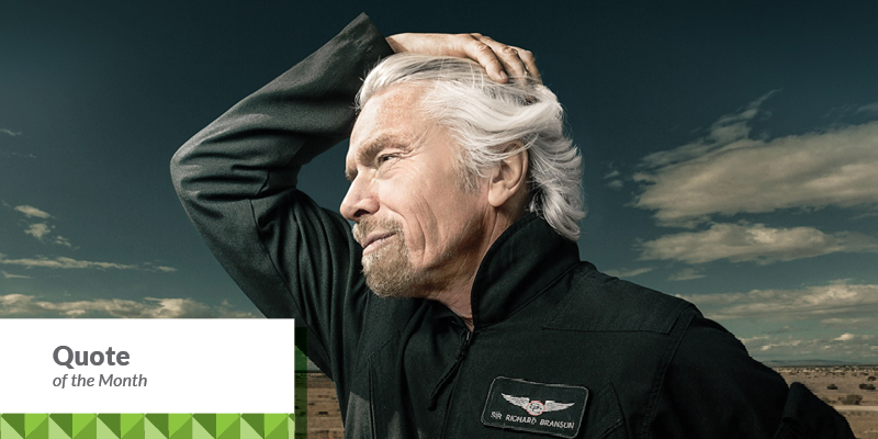
“Business opportunities are like buses, there’s always another one coming.”
Richard Branson

Colour is the catalyst that can spark the sale, define the space and create the magic and the mood.
When designing any product, knowing what colours to use is critical to your success. Brands and colours are inextricably linked because colour offers an instantaneous method for conveying meaning and message without words.
Colour is the visual component people remember most about a brand followed closely by shapes/symbols then numbers and finally words. For example, the real McDonald’s is easy to detect in the image above. Many of the most recognisable brands in the world rely on colour as a key factor in their instant recognition.
See for yourself and take the “Recognisable Brands Test”, click here.
Why Colour Matters
Research has reinforced that 60% of the time people will decide if they are attracted or not to a message – based on colour alone! Colour increases brand recognition by up to 80 percent. (Source: University of Loyola, Maryland study)
An example of Colour Branding Natural and Universal Colour Symbolism for Brands FedEx’s two different colour schemes are the best examples of the “universal” symbolism of colors. Green communicates ground services; orange communicates the high energy and speed of air transportation.
